

The Stories Behind 5 of Led Zeppelin’s LP Covers

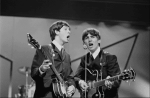
Led Zeppelin live in 1973 - Led Zeppelin Concert Footage / Youtube
An album cover is what greets the listener before an LP is tossed to a player. From loud, statement-making designs to more discreet and normal-looking layouts, album covers have been used by rock bands to convey their thoughts by way of images. Led Zeppelin joined the bandwagon as well, no matter how confident they were with their music. With that, here are the stories that make up some of the most famous Led Zeppelin album cover art.
Led Zeppelin (1969)
The famous urban legend of The Who being instrumental in the making of Led Zeppelin’s name also influenced their debut album cover art. Keith Moon joined Jimmy Page, John Paul Jones, and Nicky Hopkins on Jeff Beck’s Bolero Sessions in 1966, commenting about talks of a supergroup being formed. Moon shot back with something along the lines of “It’ll go down like a lead balloon (or zeppelin).” This led to the band using George Hardie’s ink rendering of the Hindenburg airship crash, inspired by Sam Shere’s black and white shot from 1937.
Led Zeppelin II (1969)
Led Zeppelin harkened to history with their second album’s cover art. Designer Dave Juniper attended Surrey’s Sutton Art College with Page, and was hired to do the design. He based it on a photograph of the German Air Force’s Jagdstaffel 11 Division from WW1. After a collage and airbrushing treatment, Juniper was able to replace some of the pilots’ faces with the band’s own, along with some minor facial alterations.
Led Zeppelin III (1970)
In line with the band’s changing sound on their third album, Led Zeppelin III featured a collage of aerial-related images like birds, planes, and zeppelins. Page wasn’t too pleased with the results, however, saying in a 1998 Guitar World interview that “it looked very teeny-bopperish. But we were on top of a deadline, so of course there was no way to make any radical changes to it. There were some silly bits – little chunks of corn and nonsense like that.”
Untitled (1971)
This particular cover had fans and critics thinking hard at what it wanted to achieve, with the famous oil painting of a man hauling sticks on his back. “It represented the change in the balance which was going on. There was the old countryman and the blocks of flats being knocked down. It was just a way of saying that we should look after the earth, not rape and pillage it,” Page said on Trouser Press in 1977.
“Houses of The Holy (1973)
The infamous rock formations colored by a tangerine sky and naked children making their way up on it – this was the artwork that greeted listeners on 1973’s Houses of The Holy. In a Rolling Stone interview, Hipgnosis designer Aubrey Powell said, “We had to put an obi, which is a strip of paper around the album cover, in order to hide the kids’ bottoms. In the Midwest, it as considered ‘not appropriate.’ Even then, there were people who were concerned about it. But I always used the adage, ‘When you look at the Louvre’s paintings, it’s full of naked children.’ Nobody complains about that. So this is a piece of art. It’s not something that was, in any way, devious.”